“Should I trash this or read it?” research subjects wonder as they examine a piece of direct mail. From top to bottom they evaluate the letter, and after just 11 seconds they make a decision.
During that time, experimenters from Munich’s Direct Marketing Association notice something peculiar about subjects’ eyes. They don’t follow a linear path, reading each word in succession, but instead jump around to different points in the body of the letter. So what were they looking at?
The answer is the key to creating a post-click landing page that converts, with the help of what’s called a “visual hierarchy.” To fully understand it, we’ll have to travel back to 1912 Germany, where three psychologists began forming the foundations of Gestalt Psychology.
Gestalt Psychology and the foundation of the visual hierarchy
More than a century ago, German thinkers Wolfgang Kohler, Max Wertheimer, and Kurt Koffka began studying how people perceive the world. Their names and the theory of “Gestalt Psychology” may not look familiar, but the message that encompasses their research will:
“The whole is other than the sum of its parts” — meaning the whole has “an independent existence in the perceptual system,” says Dr. Russ Dewey.
In other words, the three men proposed that humans don’t perceive their surroundings individually and equally. Instead, we organize them in specific ways to make sense of them as a whole.
Take the following image for example. What do you see?

You probably notice three partially drawn circles, but also an upside down triangle in the center where there is none. The incomplete circles form the corners of the triangle, and your mind fills in the edges. This is called an “illusory contour,” and it exemplifies exactly what Koffka meant when he said, “the whole is other than the sum of its parts.” There’s more than just three partially drawn circles in this image. Together, positioned as they are, those circles form a white triangle.
From their research, the three men created eight laws of perceptual organization — ways in which humans view components of a group as a whole. One more than any other has to do with the way people find crucial information on your post-click landing page.
The laws of similarity
The law of similarity states that similar things appear as though they’re grouped together. In the image below, what do you see?

If you said “36 circles” or “6 rows of circles,” or “6 columns of circles,” you’re in the minority. Most people see three rows of black circles and three rows of white circles. Since every other row is colored and shaped similarly, it’s seen as part of its own group within the whole.
At the same time, because of this tendency to group similar things together, we also notice things that are dissimilar to the group. The Gestalt psychologists called these dissimilarities “anomalies.”

In the image above, we group all the similar green apples together and the red one stands out as an anomaly. Whether that anomaly is dissimilar in size, color, or shape, it draws our attention because it’s different from the rest of the group.
This process of perceptually grouping elements can explain what experimenters from Munich’s Direct Marketing Association noticed in research subjects’ eyes.
What is a visual hierarchy?
Brandon Jones from Tuts+ says people aren’t “equal opportunity see-ers.” Not only do we have the tendency to notice differences between groups, but also to make inferences about importance from those differences. For example, rank the circles in this image:

Without knowing anything about them, you likely ranked them as follows:

And that’s because the biggest circle draws the most attention, then the second biggest, and so on. Now let’s apply a similar principle to words on page.
This is the most important sentence. This is the most important sentence. This is the most important sentence. This is the most important sentence. This is the most important sentence. This is the most important sentence.
In that excerpt, your eyes were likely drawn to the anomaly. You grouped the unformatted sentences together, and the bolded words stood out. When you introduce differences in size, attention is drawn elsewhere.
This is the most important sentence.
This is the most important sentence. This is the most important sentence. This is the most important sentence. This is the most important sentence. This is the most important sentence. This is the most important sentence.
This time, before you noticed the bolded words within the paragraph, you probably saw the even bigger, bolded words above it. We could keep altering words with color and positioning to make them stand out even more, but you get the point. “Different” grabs attention, and attention is what you want paid to the most important information on your post-click landing page.
With differences in design, you can strategically draw your visitors’ eyes to marketing messages that are central to driving conversions — your value proposition, your product’s benefits, and the call-to-action, for example. These attention-grabbing strategies form the “visual hierarchy.”
Within that hierarchy, the most important information is where your visitors’ eyes land first on the page, and then the second most important information is where their eyes land next, and so on. Without even realizing it, they mentally rank these elements from crucial to unneeded based on differences.
Reading styles on and off the web
Now let’s revisit the experiment by Munich’s Direct Marketing Association, in which subjects’ chose whether to trash or read a sales letter in just 11 seconds. They were able to make a decision so quickly because of design differences.
First, their eyes jumped to what they perceived to be the most important information on the page: headlines and photos. Next, captions, bulleted lists, and short paragraphs drew attention. Long, unformatted copy was digested last, if at all.
Since then, numerous studies have reinforced the findings, most notably the Nielsen Norman Group research that birthed the “F-Shaped Pattern.” After tracking the gaze of 232 subjects on thousands of web pages, the group found:
- First users read across the top of the page, creating the upper horizontal bar of the “F” shape.
- Then, people progress further down the page, reading across subheadlines to form the lower horizontal bar of the “F.”
- Lastly, users scan down the left side, forming the vertical stem of the “F.”
It looked something like this:

The name “F-shaped” is a little misleading, though. As the researchers explain, internet users’ reading patterns aren’t always so neat:
Obviously, users' scan patterns are not always comprised of exactly three parts. Sometimes users will read across a third part of the content, making the pattern look more like an E than an F. Other times they'll only read across once, making the pattern look like an inverted L (with the crossbar at the top). Generally, however, reading patterns roughly resemble an F, though the distance between the top and lower bar varies.
Regardless of whether it’s an “F,” an “L,” an “E,” or even a “Z-shaped” pattern for less text-heavy pages, the implications are the same: English-speaking people read left to right and top to bottom while scanning for differences in the content. Headlines, subheadlines, images, bolded words, captions, lists — these are elements dissimilar from the standard unformatted text.
Look at the mock pages below:

They contain no actual words, yet you’re probably able to mentally organize the right one better than the left. The right one accommodates the F-pattern style of reading, while the left doesn’t organize its content into a visual hierarchy whatsoever.
We already know from research that blocks of text like the ones on the left page rarely get read. So how do you make sure yours does?
Design with differences in mind
Before you get started creating a visual hierarchy, you need a goal, says Peep Laja of CXL:
You should rank elements on your website based on your business objective. If you don’t have a specific goal, you can’t know what to prioritize.
He uses a screenshot of a Williams Sonoma homepage to demonstrate:

The biggest eye catcher is the huge piece of meat (make me want it), followed by the headline (say what it is) and call to action button (get it!). Fourth place goes to a paragraph of text under the headline, fifth is the free shipping banner, and the top navigation is last. This is visual hierarchy well done.
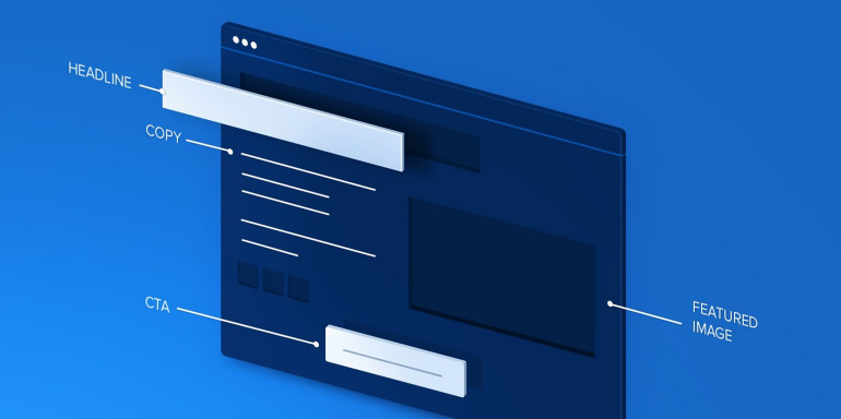
On your post-click landing page, though, there should be no navigation menu. So, attention will be drawn a little differently. Let’s take a look at a post-click landing page from Simply Measured:

Where did your eyes land first? Next? Last? If we had to guess, we’d say…
- The headline: “How to Make Social Marketing Decisions Faster.”
- The subheadline: “Learn how to save time and look like a pro.”
- The bolded text: “In this guide you will learn how to…”
- The bulleted copy below the bolded text.
- The call-to-action: “Submit.”
This is an example of a great visual hierarchy because it conveys information in the order most relevant to visitors. First, the headline and subheadline communicate the USP of the offer in a benefit-oriented way. Prospects understand immediately that they’ll learn how to make social decisions faster with the offer on this page.
After that, scanning down the left side of the page in the typical F-pattern, visitors notice the bolded text that leads them to the bulleted list, which details exactly what’s to be gained by claiming the offer.
Lastly, prospects scan a little further down, then across the page, where they see the call-to-action button which has been colored differently than the rest of the elements on the page to draw attention. It lets them know how to claim their offer.
The body copy may get read in full after those three elements are fixated on, but it may not — which is why it’s important to make your most important information stand out. In this order, your visual hierarchy should at the very least:
- Capture attention with a headline and let visitors know why they should read the rest of your page.
- Elaborate briefly on the benefits of your offer with bolded words, bulleted text, and small paragraphs.
- Show them how to claim the offer with a call-to-action.
So how exactly do you do that with design elements? You know “different” draws attention, which in turn conveys importance — but which design elements should you use when creating a visual hierarchy?
The characteristics that impact visual hierarchy
According to freelance designer and author Steven Bradley, five characteristics can be manipulated to form visual hierarchy on your page:
- Size — As you would expect larger elements carry more weight
- Color — It’s not fully understood why, but some colors are perceived as weighing more than others. Red seems to be heaviest while yellow seems to be lightest.
- Density — Packing more elements into a given space, gives more weight to that space
- Value — A darker object will have more weight than a lighter object
- White space — Positive space weighs more than negative space or white space
The degree to which you use these elements on your post-click landing page will affect where your visitors’ eyes land. Here’s how to use them to create your visual hierarchy:
- Size: Your headline should be the biggest text on your page. If you have one, the subheadline should be the second-biggest. Smaller than that should be the subheadings you use to separate content if your page is long, and the smallest should be the unformatted body copy.
- Color: This element is most important for your call-to-action. Color scheme plays a big part in guiding your visitor to your button. The key here is contrast. Notice that on the Simply Measured post-click landing page, the color orange appears only once on a primarily blue and white page. That makes the CTA button exceedingly noticeable to the visitor.
- Density: Look up at the Williams-Sonoma page again. The headline and call-to-action are both overlaid on the featured image. By packing all these elements into such a small space, the designers have drawn more attention to it than the menu or banner above.
- Value: Bolded words attract more attention than unformatted ones. Your headline, subheadline, and body copy that introduces the benefits of your offer should have more value than the rest of the text on your page.
- White space: Remember back to the results of the study by Munich’s Direct Marketing Association — one of the biggest attention-grabbers is small paragraphs. “Chunking” your text into sections made up of three sentences maximum can make it not only more attention-grabbing, but easier to read and retain as well.
Get your most important information read
The visual hierarchy helps visitors prioritize the information on your post-click landing page. Get your visitors to convert by creating one that:
- Emphasizes your USP in the headline
- Conveys the benefits of your offer in the body copy
- Lets prospects know how to claim your offer with your CTA button
Start designing your visual hierarchy quickly and easily, sign up for an Instapage Enterprise demo today.

See the Instapage Enterprise Plan in Action.
Demo includes AdMap™, Personalization, AMP,
Global Blocks, heatmaps & more.
