
There are a lot of resources online that address mobile post-click landing page designs, but there isn’t a lot of specific design instructions how to actually build a high-converting page.
What structure layout is recommended for mobile viewing? How many pixels should buttons be? How many pixels should separate elements? Should you use the “hover” effect? Should form labels be inside or outside?
My name is Cosmin Serban, Director of Design Services at Instapage. You may be asking, What makes Cosmin qualified to write on mobile post-click landing page design?
I’ve been educating customers on best practices in designing and structuring their post-click landing pages to improve their conversion rates. Also, I have:
- Reviewed over 1,000 post-click landing pages
- Partnered with customers to ensure their message is getting across and their visitors have a good experience that eventually leads to a conversion
Furthermore, I was part of the team that has developed over 200 optimized templates used to create and launch over 200,000 post-click landing pages, you can find the templates here.
Mobile post-click landing page design: What to know before you begin
Some concepts in this article were developed internally when creating our template library. That doesn’t necessarily mean that all of these tips should apply to every single post-click landing page you create. Each post-click landing page has its own unique set of challenges, but understanding these basic notions should definitely help you provide a better experience for anyone visiting from their mobile device.
Let’s start with the most important differences between the desktop and mobile experience.
Structure
Even though it doesn’t seem like it at the beginning of your project, having a structure in place where you deliver the right group of elements at the right time is more critical than you think.
The first thing that comes to mind is the completely different way our visitors will scan the content on mobile pages. We’ve all heard about the F-pattern or Z-pattern on desktop post-click landing pages, but what is the pattern for mobile called? We won’t necessarily give it a name, but most likely it is very linear. Scrolling up and down is the only way to understand what that post-click landing page is offering:
Since that is one of the most important limitations how visitors interact with a post-click landing page, we suggest sticking to a one-column layout instead of trying to cram in a lot of content horizontally. (Nobody likes to pinch and zoom.)
On desktop, most of the time digital marketers think about the placement of each individual element and the impact it has. On mobile, it’s better to make a shift and think about groups of elements and how you stack them on top of each other for maximum impact.
This side-by-side comparison shows how a desktop page is structured versus a mobile page:

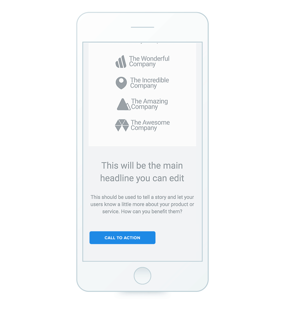
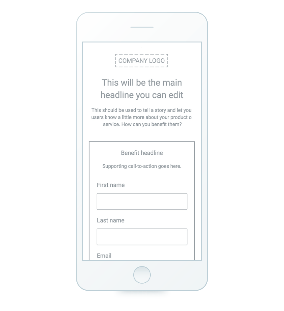
We recommend going from left to right and placing each group of elements underneath each other. Let’s take the header area (above-the-fold) for example. We’ll have the logo at the top, followed by the group made out of the main headline and supporting headline, then have the whole form box group underneath.
The ability to group elements creates a natively mobile responsive set of objects. Alternatively, groups can be configured to lock the aspect ratio of complex arrangements to maintain their exact proportions when they’re converted to the mobile version of your page.
Mobile Aspect Ratio Lock keeps your layered groupings together and locks the aspect ratio, whether they’re on a desktop or mobile layout.
Any two or more elements closely related or complementary to each other should always stick together. In this situation it wouldn’t make sense to have the form box right at the top of the page, so the concept of having the form in the above-the-fold area is not ideal. Giving the visitor the context of what they’re signing up first is more important than just giving them a way to act as fast as possible.
Loading time
No matter the device your visitors are using, page load speed is very important. Please be mindful that most of your visitors will use their mobile data limitations and incur costs to see your page, so be careful what kind of graphics or elements you add to pages. Just imagine accessing a page and having a video automatically play.
If you require a lot of animations for supporting content, we suggest sticking with simple images for mobile. By simple, I mean you’ll need to create custom background images for a particular section. Using a photo editing software to adjust the size or layout of the photo just might be worth the extra time required when it means you can speed up your pages.
Same thing with background images, since you don’t need an image that is 2,000 pixels wide that is 300kb to load up in your section, I suggest getting a designer to create a custom tailored image which you can set as your section background:

Most of the time keeping the mobile page as simple as possible is always a good idea. For example, if you have multiple graphical elements that convey the same message, just show one on mobile.
Since most mobile phones will adapt to the size of the content area provide in the mobile builder, a good rule of thumb is to have an image that’s at least 400 pixels wide to ensure there aren’t any empty spaces on the sides.
Build an AMP post-click landing page
Creating a positive post-click landing page on mobile is essential since the post-click landing page is where conversions happen. If your page loads too slowly or creates a disjointed experience from ad to post-click, visitors will bounce.
Then, consider that Google looks at post-click landing page experience as one factor to determine ad rank, which ultimately contributes to your click-through rate. Add all of that up and brands have a major issue on their hands. Fortunately, the AMP framework exists.
AMP pages in particular are attractive to advertisers because they allow for more compelling mobile user experiences through near-instantaneous load times and smooth scrolling, while still supporting some styling and branding customizability. Since AMP restricts HTML/CSS and JavaScript, it allows for faster post-click landing page rendering. Unlike traditional mobile pages, AMP pages are automatically cached by Google AMP Cache for faster load times in Google.
The AMP framework’s benefits truly outweigh its limitations:
- Faster page load speed on mobile devices
- Better user experience for mobile browsing
- Using AMP pages can help increase your Quality Score
- Google Will favor pages that use AMP
As of June 2018, Instapage offers AMP post-click landing pages where digital marketers can build AMP-compliant pages within the app without a developer. Because, in the end, if page load isn’t instant, it’s not fast enough.
Designing for touch
One of your biggest challenges with mobile post-click landing page design is making sure it’s as easy as possible for visitors to take action. That action could be a form submission or a simple tap on a button. You would expect most people are going to make some adjustments, but that’s not always the case.
We’ve all experienced pages where it’s very hard to tap on something or the experience is not tailored for mobile users. Especially text links — adjusting the size of any text element that is hyperlinked is very helpful. Your visitor shouldn’t have to zoom in to take your desired action.
Buttons
But the biggest issue we’ve noticed is the size of the buttons on post-click landing pages. Our team recommends designing buttons that are at least 70 pixels in height and don’t be afraid to make them as wide as possible, but never stretch them the full width (400 pixels) as they might be confused with a small section.
The hover effect is a nice touch for desktop pages because it signals to the visitor they can take action on that particular element. On mobile, through, hover effects are redundant.
Margins
For margins we recommend keeping a safe zone of at least 20 pixels vertically free on each side and avoid any visual tension that may appear with elements too close to the sides of the phone screen.
White space is something that’s just as important to mobile pages as it is for desktop pages. The basic concepts still apply, just try to space everything out and not have elements really close to each other. Doing this will help you avoid visual tension.
Having consistent margins will definitely lead to a better user experience. Our team usually makes sure to have at least 20 to 40 pixels between each element. How much you decide is up to you since each block might have a unique structure of elements.
It’s pretty subjective, but once you establish a rule try to replicate it throughout the page and that will give it a more modern look:
Readability
You would think that being able to clearly read the content is a given, but too many times we’ve seen post-click landing pages where the text is either too small or too big. Finding a good balance is pretty easy, a good rule of thumb for the font size used for particular elements are:
- Main headline: 28 pixels
- Subheadline: 22 pixels
- Paragraphs: 17 pixels
- Other details: 15 pixels
Of course you can adjust those sizes since there is not one size to fit all needs. However, it should serve as a good baseline going forward with designing a mobile post-click landing page.
Another item worth mentioning is the line height with text elements.
In certain situations on desktop it makes sense to have 1.0 or even 1.2, when you build your mobile post-click landing page make sure the line height for text elements is at least 1.4.
Bottom line: The smaller the font size, the bigger the line height should be.
Forms
Since forms are the most important part of most post-click landing pages, making it easy for people to submit their information is critical.
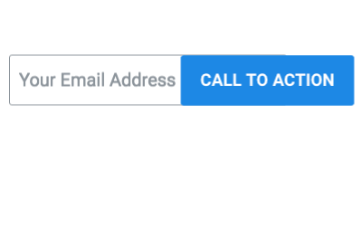
Throughout our mobile pages we usually stretch the form fields as much as possible horizontally and avoid situations like having a form field and the button on the same line. That’s just a bad experience:
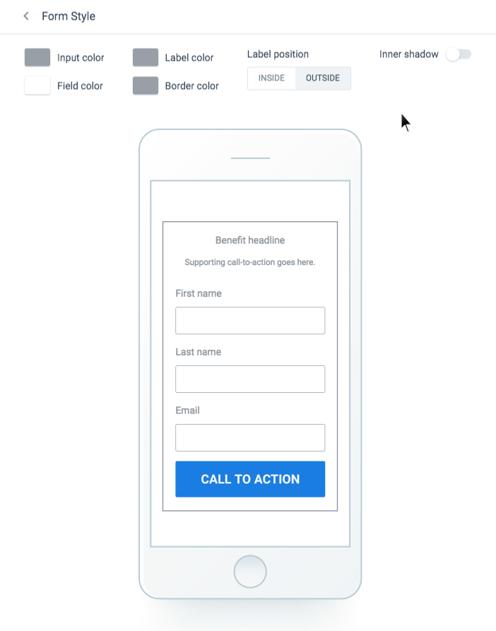
Another thing that comes out very often is dealing with forms that have a lot of fields.
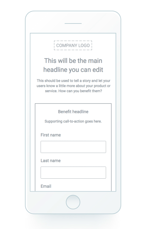
The best practice our team uncovered is that whenever a page has more than 2 form fields to set the label position to outside, making it easier for visitors to know what information is needed instead of trying to remember what to input:
Increase your mobile conversions starting today
Just like desktop pages, mobile post-click landing page design is all about user experience first and what will persuade people to engage and convert. Without taking into consideration the suggestions above, your mobile conversion rate will likely suffer and people will bounce.
Consider implementing the recommendations and see how your post-click landing pages transform into highly-optimized conversion assets. Get an Instapage AMP demo today.

See the Instapage Enterprise Plan in Action.
Demo includes AdMap™, Personalization, AMP,
Global Blocks, heatmaps & more.