
Considering creating mobile responsive post-click landing pages?
Good. Now is definitely the time. You’re getting left behind if you aren’t catering to your mobile audience. Need proof?
This Google trends graph is pretty clear on where users stand with mobile:
Need more? 70% of mobile searches lead to online action within an hour. (iAcquire)
And just so we’re clear, don’t forget that Google’s latest algorithm update expanded the use of mobile-friendliness as a ranking signal.
Mobile responsive post-click landing pages are the newest trend on the post-click landing page block, and they are here to stay.
As more people start using their mobile devices as their primary means of accessing the web, mobile optimization is becoming something you can’t afford to ignore.
You optimize your post-click landing pages to get more conversions, right? Well, now you have to do it for mobile users, too. Why? 74% of people use their mobile phones to help them while shopping. (Forbes)
If you want your customers to buy your product, you need to ensure your pages look good on their smartphones.
Lately, we’ve seen a lot of companies using the term “responsive” in a less than accurate way, and we want you to know what a real responsive page looks like. That’s why we have gone through a massive number of mobile post-click landing pages and picked out the gems for you to learn from.
Before we get to the examples, let’s make sure we’re all on the same page about what responsive pages are.
What are Mobile Responsive post-click landing pages?
Mobile responsive post-click landing pages are pages that are compatible with mobile devices. The compatibility ensures that your visitors have the best experience on your post-click landing page even on a small screen, which increases your conversions.
Not sure how to make your post-click landing pages mobile responsive? This checklist covers the most important aspects of mobile post-click landing pages.
- Quick load time
- Short, action-oriented titles
- Short, smart post-click landing page copy
- A CTA button that works well in touchscreen mode
- Keeps the most relevant information above the fold
- Looks good in landscape and portrait mode
- No uncessary navigation links
- Asks for minimum information on forms
- Possibly uses a “click to call” button versus a CTA button.
Curious what this looks like in action? Here’s a showcase of 5 great mobile responsive post-click landing pages.
Moto 360
Here’s the desktop version:

Here’s the mobile version:

See the difference?
The desktop version has a nav bar at the top of the page, whereas the mobile version does not. The headline has the same wording, but it’s in a different format. On the mobile version, the first line you read is “A watch for our times,” and on the desktop version, it’s “Moto 360.”
The images and CTA button are the same – only the format is different. This keeps brand consistency across channels, while respecting that the mediums call for different approaches.
Gumroad
Here’s the desktop version of the post-click landing page:

Here’s the mobile version:

They haven’t actually made any changes in the versions. However, the mobile version fits the screen perfectly. You don’t have to pinch the screen or anything. This is a great example of simplicity in post-click landing pages that acknowledges the importance of mobile interaction from the get-go. The desktop version was most likely created as an expanded version of the mobile version.
Rdio
Here’s the desktop version:

Here’s the mobile version:

The headline is the same, but it works on both platforms because it is short and action-packed. The only difference is on the mobile page where there’s only one CTA – the one that gets you the app. That’s what we call responsive.
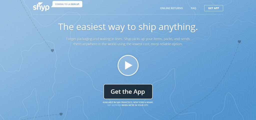
Shyp
Here’s the desktop version:
Here’s the mobile version:

There are no navigation links on the mobile version. The headline is the same and so is the body. However, as soon as you go below the fold, the versions change. There’s another CTA button at the end of the mobile version, whereas the desktop version however just has another navigation bar. (Have you guys tested that, Shyp? Curious about the effect on your conversion rates and how they compare.)
SquareSpace
Here’s the desktop version:

Here’s the mobile version:

The mobile version has the same headline, the same copy, and the same images. Again, what it doesn’t have are the navigation links at the top of the page. Another thing the mobile version doesn’t have is the CTA button that scrolls along with you.
Mobile responsive post-click landing pages are here to stay.
To turn ad clicks into conversions, create dedicated, fast-loading post-click pages for every offer. See how to provide all of your audiences with unique post-click landing pages by signing up for an Instapage Enterprise Demo today.

See the Instapage Enterprise Plan in Action.
Demo includes AdMap™, Personalization, AMP,
Global Blocks, heatmaps & more.
