No matter how well you design your landing page, it’s unlikely visitors will see every element of it. What’s even more concerning is the information your visitors miss could result in you losing conversions.
Luckily, there are ways to control for this. By understanding landing page patterns—where visitors look and when they look there—you can ensure your audience sees all your essential content.
Types of landing page patterns
According to Nielsen Norman—the group that identified the F-pattern with early eye-tracking research—there are several distinct patterns of reading on the web. Which one your visitor uses to consume your page depends on several factors, like how you’ve arranged your page, how easy it is to comprehend, what you’re offering, etc. Here are a few of the most common, and some you may not have heard of.
The F-pattern
The F-pattern of reading is the best-known landing page pattern. It starts with a fixation on the page’s upper left-hand corner, then progresses as follows:
- The user will scan horizontally across the top of the page, forming the upper bar of the “F.”
- The user will return to the left margin of the page and scan down until they reach an element that attracts their eye.
- The user will scan horizontally, but not all the way across, forming the lower bar of the “F.”
- The user then returns to the left margin and scans vertically down the rest of the page.
Advertisers can learn a few things from this. First, the top of a page gets more attention. Users are more likely to consume headlines and featured images than body copy. Second, visitors will probably read the first few words on a horizontal line, but maybe not the last.
None of this is particularly surprising when you consider that users are scanning for specific information. They’re not reading for pleasure. They’re looking for headlines, images, subheadlines, bold text, and bullets to get your page’s takeaways without having to read all its content. Early eye-tracking studies from Munich’s Direct Marketing Association confirm this.
It’s important to clarify that users follow the F-pattern when they’re consuming content specifically, not when they’re exploring a new page and scanning across the navigation menu. The pattern is also rarely a perfect “F.” Many times, it forms an “E” on longer pages with more content to scan.
The Z-pattern
The Z-pattern is another prevalent reading pattern on the web. Like the F-pattern, it begins with the user entering from the upper left-hand corner, then skimming across the top of the page to form a horizontal bar. Also, like the F-pattern, Z-pattern readers move back to the left margin after they’ve consumed the top of the page.
Unlike the F-pattern, though, the Z-pattern gets its diagonal crossbar from the way users move back to the left margin. In this case, they’re not creating the second bar of an “F” by jumping to the left margin and reading across again. Instead, they appear to be skipping a lot of content in the middle of the page.
The difference here is that the F-pattern is more applicable to text-heavy pages. Of course, there’s going to be more horizontal left-to-right movement on these pages, because users are reading content. But your average webpage won’t have that much copy. That’s why you have the Z-pattern.
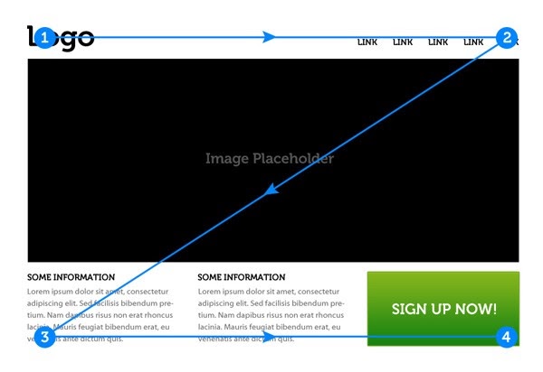
This zigzagging is the result of users moving between content chunks on your page. While they do it slightly differently, in the end, both F- and Z-pattern users are looking for the same thing: information relevant to what they want to know.
Other common landing page patterns
Though the F-pattern and Z-pattern are the most natural among web users, they’re not the only ones. According to NNG, there’s also:
- The layer-cake pattern, which will show horizontal lines that look like a dessert with alternating layers of cake and frosting. These result from readers’ eyes scanning headings and subheadings, but skipping the body copy below.
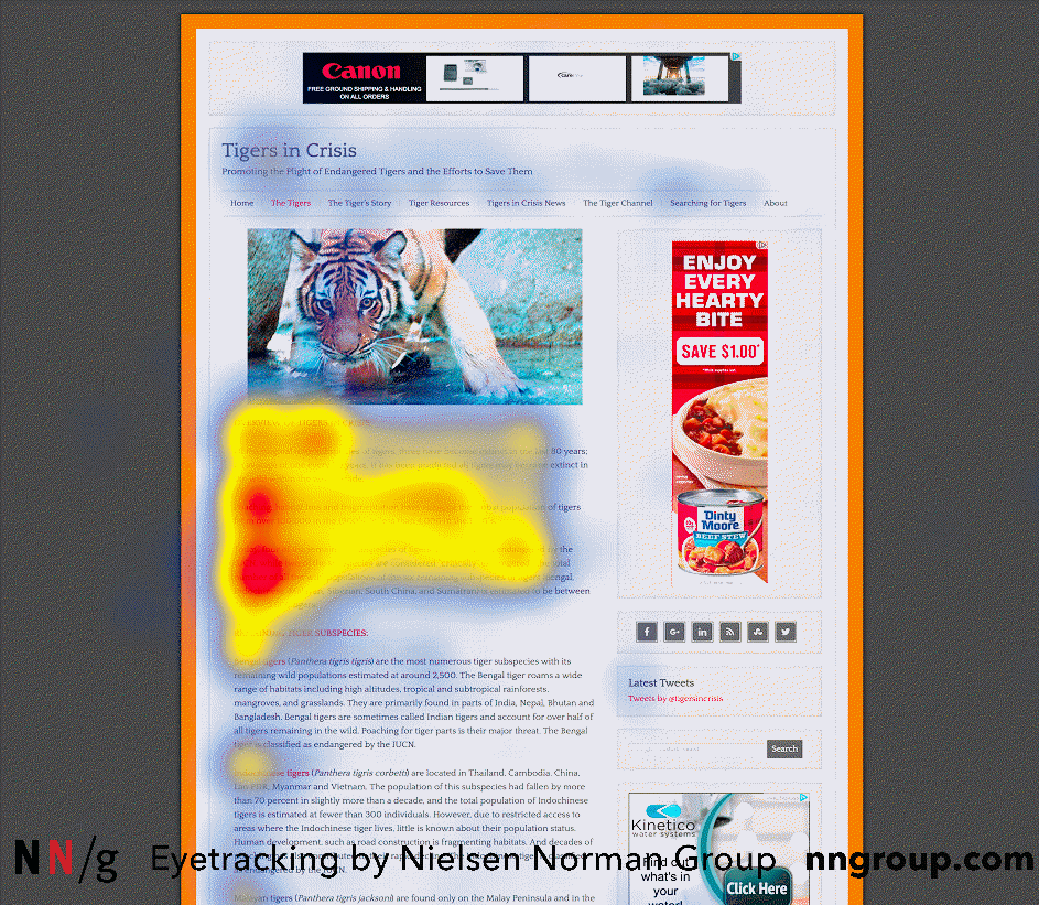
- The spotted pattern, which creates a heat map with many seemingly random spots. This pattern results from readers looking for something specific, like a phrase, word, link, or numbers in a particular format like an address or phone number.
- The marking pattern, which creates a heat map that shows a consistent line across or down a page, formed when the eyes focus in one place as the mouse scrolls or finger swipes.
- The bypassing pattern, which creates a heat map that indicates users are not scanning, but deliberately bypassing content. This phenomenon usually happens when multiple lines of text in a list start with the same word or phrase, so reading them all is unnecessary.
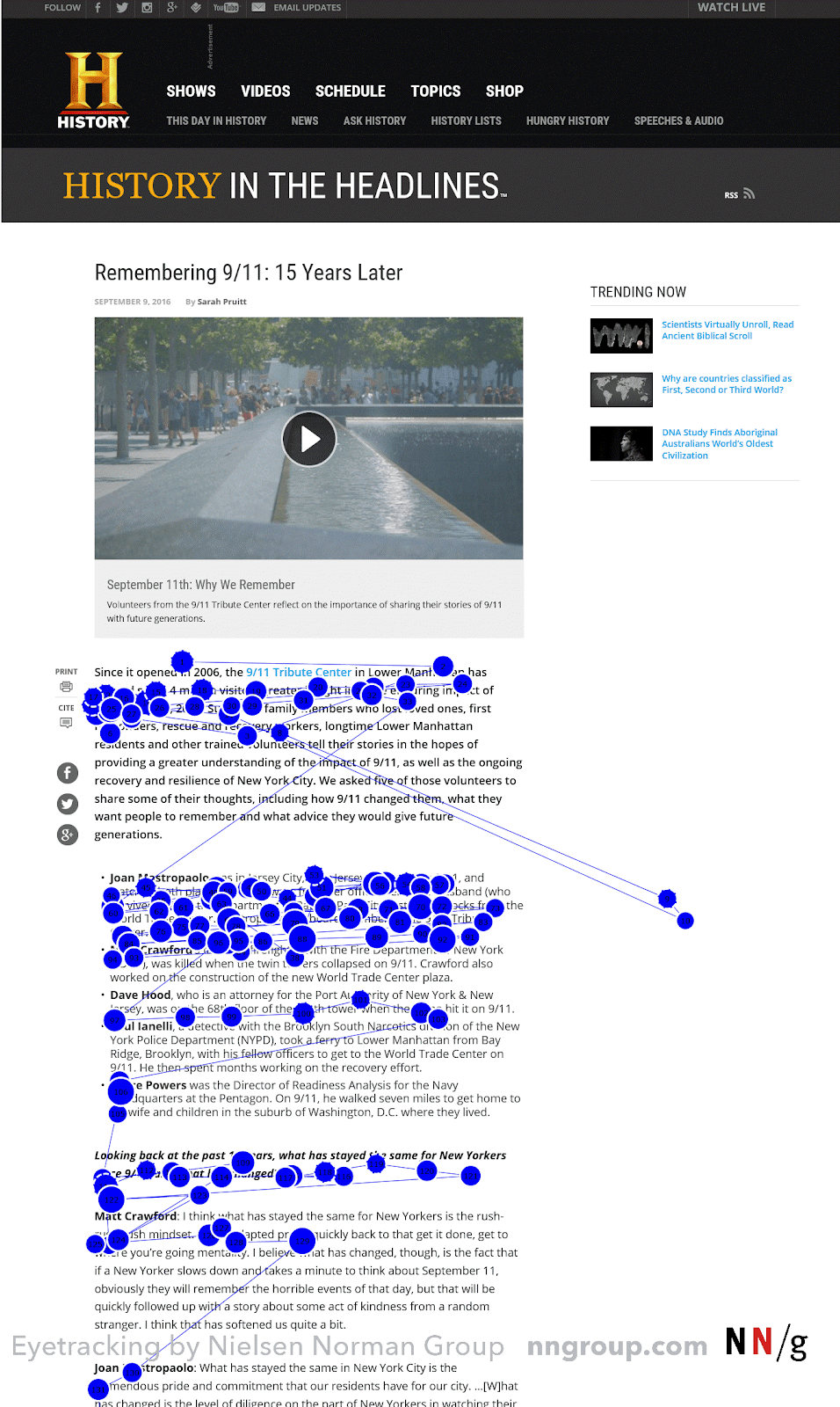
- The commitment pattern, which creates a heat map that shows the user fixating on almost everything on the page. This pattern is the closest thing to pleasure reading on the web, so don’t count on it happening on your landing page. But if the conditions are right, users can be interested enough to consume an entire page’s content.
Landing page patterns: What does it all mean?
It’s easy to get caught up in all the ways people consume content on the web. If you’re like most advertisers, you’re always looking for an edge over your competitors. And while optimizing for reading patterns can get you that edge, it’s not worth obsessing over. That’s because eye-tracking research on landing page patterns doesn’t tell us a whole lot that we don’t already know. Most crucially:
- Most people read left to right. Always keep text aligned left. Aligning right can create a jarring reading experience for the eye.
- People read top to bottom. Put your essential content at the top: value proposition, hero image, etc.
- People are lazy. They’re going to consume as little of your landing page as they need to understand your offer. They’ll skim for headlines, images, subheadlines, bolded copy, and bulleted text to get the gist of your product. So, ensure your most important takeaways are in that content.
Overall, the exact landing page pattern your visitors follow will vary based on the page. Instead of aiming to accommodate F-pattern readers or layer-cake readers, your goal should be to create content that’s easy to consume.
Follow these tips:
- Put your most pertinent information at the top of your page. Get your value proposition in the headline and message-match your ad.
- Organize your content with headings and subheadings to make it easy to skim. Make your subheadings bigger and bolder than your body copy.
- Put the most important information in the first few words of your headers and body copy.
- Use bullets to quickly summarize items, such as a list of benefits.
- Bold key words and phrases.
- Be comprehensive, but concise.
- Group related elements together to make them easier to find and comprehend.
- Create contrast between essential elements and your page’s background. Higher contrast equals higher importance. For example, your CTA button should be the highest-contrast element on your landing page.
Ultimately, the F-pattern and Z-pattern don’t benefit readers or advertisers. Deliberately arranging your content in these alignments can result in users skipping valuable information. The best landing page designs draw maximum attention, but they also accommodate the scanning reader.
Want to create hundreds of attention-grabbing, personalized landing pages for all your audience segments? Get a complimentary demo of Instapage to find out how.
