Now. It’s when we want what we want.
It’s when we want our meal, our TV, our news… and pretty much any other product or service we have the money to order.
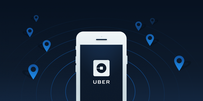
In today’s world of instant gratification and right-now resources, arguably no brand has become more synonymous with “on demand” than Uber.
The service was the first of its kind to transform the archaic system of hunt-and-hail to flag down a taxi cab, into a simple series of taps that would accomplish the same goal.
After its breakthrough into the mainstream, it didn’t take long before people recognized the genius of Uber. The market for on-demand service apps was largely untapped.
Soon there was an Uber for grocery shopping, for alcohol, for massages, and even for marijuana delivery.
And while the concept of on-demand services has grown to become even bigger than Uber itself, currently the company continues to grow at a staggering rate.
Today, over 8 million users in 400 cities have solicited over 1 billion rides from the on-demand, cab-alternative service. And the business’s main competitor, Lyft, can only be described as the David to their Goliath, with even slimmer odds than the biblical underdog of coming out on top.
Lagging way behind, Lyft counts only 100,000 users in 60 cities.
So, what’s Uber’s secret?
Is it their technology? Is it their drivers? It is both, and, just as important, it is their marketing.
Today we’re going to find out how successful ride-requesting app, Uber, is at creating compelling post-click landing pages that get people to convert.
What is a post-click landing page?
A post-click landing page is any standalone page not connected to a website’s navigation, which has been created with one goal in mind, and one goal only: to get visitors to convert.
It may be to sign up, to download, to order, or to subscribe. Whatever the action is, the goal of a post-click landing page is to elicit that action using persuasive elements and a powerful call-to-action.
Now let’s look at a few ways Uber uses post-click landing pages.
How Uber uses post-click landing pages
1. To get drivers to sign up
Here’s the first Uber post-click landing page we found in our research:

Let’s talk more about this post-click landing page: who is it for, why was it built, what is it doing well, and how could it improve?
Who is it for:
- In this case, the audience is potential drivers.
Why was it built:
- The company is trying to keep up with its growing user base by recruiting as many new employees (drivers) as possible.
What it does well:
- Few form fields make this post-click landing page form easy to complete. Instead of using one super-long form, Uber has separated the sign-up process into a number of steps. You can tell by the way the CTA button is labeled “Next,” indicating this is only the first part of the onboarding process.
- A benefit-oriented headline takes the lead on this post-click landing page. It conveys to the viewer that they’ll “Get paid weekly with Uber” and be able to make their own schedule. These are two of the biggest draws for anyone considering driving for Uber.
- Concise copy boosts the potential conversion rate of this page. It emphasizes a high pay rate, a flexible schedule, and a simple sign-up process.
What it could improve:
- A cheesy stock photo is a big focal point on this page. Research has shown that those don’t perform very well compared to real people in real situations. Now, it’s certainly possible that this is a photo of a real Uber driver taken by a professional photographer, but… does it look like it? That cheesy smile says “no” to us.
- The “Sign up to ride” button makes signing up easy for those looking to ride with Uber, but I stumbled across this page upon clicking a PPC ad after searching “make money car” in Google…so why would I care about riding right now? I want to learn how I can make money with my car. We understand what Uber was trying to do here, but on this post-click landing page, all that button does is give the prospect a way out.
2. To get riders to sign up
Here’s an Google Ads post-click landing page aimed at a completely different audience. We found it after searching “ride Uber” in Google:

Who is it for:
- All signs point to this post-click landing page being aimed at the audience looking to use Uber as a taxi cab alternative.
Why was it built:
- To generate more riders.
What it does right:
- Without navigation, there’s no way to drive potential riders off this page.
- This copy conveys a clear benefit, and it’s short, sweet, and to the point.
What it could improve:
- Badges that emphasize privacy would be a great trust-booster on a post-click landing page that’s meant to capture credit card information.
- The CTA is nothing special. If it used personalized copy such as, “Create My Account” or “Become a Rider” would be better.
3. To deliver geo-targeted offers
Here’s something we don’t get to do often: Highlight a post-click landing page that drives visitors from an offline source. In this case, the source is a street ad in New York City:

When you type “uber.com/newyork” into your browser, you’re taken to this post-click landing page:

Let’s talk a little more about it.
Who is it for:
- Riders, as evidenced by the headline and sub-headline combination: “Sign up and ride with UberX” and “Uber is now cheaper than a New York taxi.”
Why was it built:
- To generate new signups in New York City.
What it does right:
- Minimal copy makes this post-click landing page easy to digest. It’s short, sweet, and encourages the visitor to take the desired action (sign up now).
- Symbiotic calls-to-action can be seen in the middle and the bottom of the page. Normally, we recommend staying away from multiple calls-to-action, but in this case it’s okay because they both accomplish the same thing.
- Good message match between the street ad and the post-click landing page boosts trust, letting prospects know they’re in the right place. Both examples include the text, “Now cheaper than a New York City taxi.”
- Images add value to this post-click landing page. Unlike the cheesy photo of a guy driving, these give an inside look into what the app’s interface is really like on different mobile devices.
- The strong value proposition, represented by the sub-headline “Now cheaper than a New York City taxi,” is convincing.
- No links and no navigation makes this page impossible to escape without clicking the CTA or closing out of the browser window. That’s exactly how it should be.
What it could improve:
- The CTA’s are boring. What’s with “Get started” and “Sign up now?” How about something that communicates the value proposition, like “Start riding for cheap” or “Begin riding more affordably.”
- The order in which the headline and sub-headline are presented may be confusing. “Sign up and ride with UberX” doesn’t convey how this offer benefits the visitor; but “Now cheaper than a New York City taxi” does convey Uber’s benefits. You always want to highlight your value proposition boldly, so switching the order of these would create an even more powerful effect.
4. To give away “free” rides
At a quick glance, you might think this post-click landing page is completely identical to one of our earlier examples. But a closer look reveals otherwise:

Who is it for:
- Potential riders. The only difference between this and the post-click landing page in example 2 is that it’s conveying an even stronger benefit — the promise of a free ride.
Why was it built:
- To drive new rider signups by offering a ride discount.
What it does right:
- The “free” offer is highlighted prominently in the post-click landing page’s headline.
There are no outbound links included on this page, so there’s no way for prospective drivers to escape. - The logo isn’t clickable. On most pages, logos like the “Uber” one at the top are linked to the homepage. But on post-click landing pages, that’s a big no-no because it serves as an escape route for visitors. You can include your logo, just make sure it isn’t connected to your main site.
What it could improve:
- The offer isn’t really free, is it? Free is mentioned multiple times, and in big, bright letters in the headline, but direct your attention to the bolded copy underneath it, which reads: “Sign up now to claim your free gift from Jesse ($15 off first ride).” Seems a little deceptive, doesn’t it?
It’s great that Uber is offering discounted first-time rides for new signups, but they’re certainly not free.
What if your ride costs more than $15? You have to pay the remaining amount. The company would be better off positioning the offer as a discount as opposed to a free ride.
- This CTA is a straight up snoozefest, as it was in example 2. Something that reinforces that value proposition, like “Claim my $15 discount,” would likely boost conversions on this post-click landing page.
- No security badges. On a page that collects very sensitive information like credit card numbers, these would certainly help to alleviate any feelings of mistrust, or second thoughts a prospective customer may have about completing this form.
5. To highlight a seasonal promotion
Here’s another Uber post-click landing page that might fool you if you’ don’t look closely. At first, it seems like it could be a clone of example number 3, Uber’s New York City post-click landing page. And while they both use all the same elements below the fold, above the fold they are completely different:

Who is it for:
- This Uber post-click landing page has been made to drive new rider signups.
Why was it built:
- At first it might seem strange that a post-click landing page created to highlight a summer promotion ($30 off your first ride) is still active in the winter.
However, leaving a seasonal post-click landing page up in the off-season is more common than you think. For example, many brands leave their Black Friday post-click landing pages online even after the holiday season, to capitalize on year-round traffic.
What it does well:
- The image above the fold is crisp and colorful. Our guess is it’s a stock photo, but she could very well be a customer using the Uber app.
- The images below the fold add value by giving prospective riders a sneak peek what the app looks like from the inside.
- The offer is compelling. If you thought $15 off your first ride was great, how do you feel about $30? Probably the same way you feel when you pull a $20 bill out of an old coat you haven’t worn in a while. Makes you want to treat yourself, doesn’t it?
What it could improve:
- The big selling point is under-emphasized that we actually missed it the first time we looked at the page. That should never be the case, especially with an offer as great as $30 off your first ride. Even a simple headline like “Get $30 off your first ride this summer” would be better than “Treat yourself this summer.”
- CTA buttons are highly unremarkable, which is also the case on the New York City post-click landing page, this page’s sister. Instead, the company should reinforce their value proposition by using text like “Claim my $30 credit” on the button instead of some cookie-cutter text like “Sign up now” or “Get started.”
What do you think of Uber’s post-click landing pages?
Using post-click landing pages and a combination of other marketing methods, Uber has been able to dwarf its competition — generating a user base over 80x larger than its biggest rival, Lyft.
Start creating your dedicated post-click pages by signing up for an Instapage Enterprise demo today.

See the Instapage Enterprise Plan in Action.
Demo includes AdMap™, Personalization, AMP,
Global Blocks, heatmaps & more.
