
Since the first banner ad was introduced in 1994 and earned an impressive 44% click-through rate, the number of banners served has grown tremendously, but their CTRs have plummeted. They reached only 2% in 1995, 0.6% in 2003, and just 0.5% in 2019.
While a major reason for the big drop is because most web banner ads have become irrelevant, intrusive, and just plain boring — there’s a bigger, more detrimental phenomenon causing even the good ads to be ignored.
That phenomenon is known as banner blindness.
What is banner blindness?
Banner blindness occurs when people ignore banner ads, either knowingly or unknowingly.
Web users have become overwhelmed with online content that they now automatically filter out ads as unwanted noise, both intentionally and unintentionally. With limited attention spans and sensory overload, people tend to selectively direct their attention only to a subset of web content — usually related to their goals:
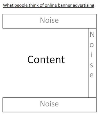
Content and UI elements on the web all fight for users’ attention because people have learned to pay attention only to those elements that are helpful to them (navigation bars, search boxes, headlines, etc.) and ignore those that aren’t (irrelevant, intrusive, boring ads). Many users have learned to ignore any content that even resembles an ad, is close in proximity or appears in locations traditionally dedicated to ads.
Think about your own online experience — can you recall a banner advertisement you’ve seen on Google this week? Or even today?
In fact, banner blindness research shows that only 14% of people remember the last ad they saw, meaning 86% of web users suffer from ad blindness.
The epidemic was first documented by Nielsen Norman Group in 1997 through basic usability tests, replicated in more detail in 2007 with an eye tracking study, and then revisited again in 2018 as an eye-tracking and banner blindness study. With three decades of ad blindness research, it’s likely the robust phenomenon isn’t ending anytime soon.
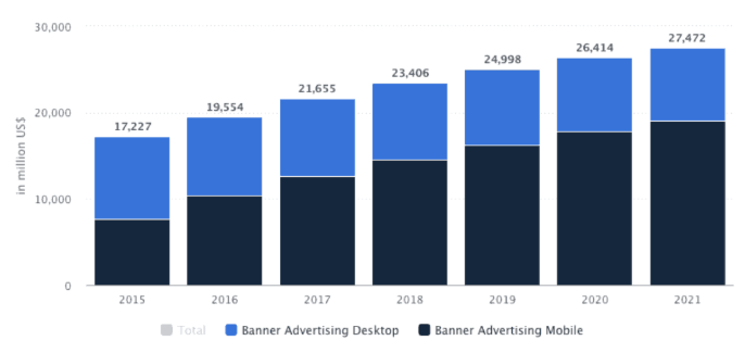
However, banner ads are a survival mechanism in online advertising, so eliminating them isn’t an option. What’s more — despite all the statistics out there showing how banners have become ineffective, they continue to generate significant revenue for brands and are expected to continue doing so for years to come:
So it comes down to having to fight banner blindness.
The 5 best ways advertisers can minimize banner blindness
1. Understand how people read on the web
Banner blindness can’t be completely eliminated due to ever-evolving user behavior patterns. However, it can be minimized by understanding how users behave online, and then testing different ad sizes and locations accordingly.
A web page is made up of several different elements, each varying in importance. So for the page to be effective and the elements to gain the most visibility and action, they must be situated at the right locations.
Several experiments have been done to understand typical reading patterns and eye movements of Internet users to identify what those “right” locations are.
In the famous F-Pattern study by Jakob Nielsen, the reading pattern of over 232 users was observed through heatmaps, and it was discovered that the dominant reading pattern resembled the letter F:
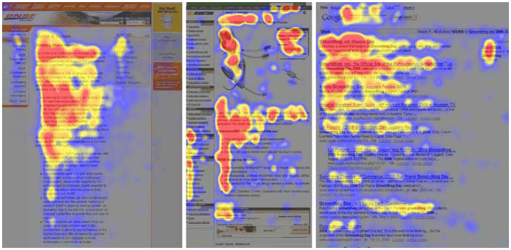
- People first read in a horizontal direction across the top of the content
- They moved down the left side of the page and across another, shorter horizontal line
- Lastly, they moved in a vertical fashion again, scanning further down the left side of the page
Of course, there are some exceptions to the F-shaped reading pattern. Some users follow a reading pattern shaped like an “X”, an inverted “L”, or a “Z” — all of which would require advertisers to position ads in different places.
For example, while positioning ads along the F-Layout works best on copy-heavy pages (blog posts, search results pages, longer sales pages, etc.), while the Z-Pattern is better suited for pages with minimal copy.
The majority, though, follow an “F”-shaped pattern. This is why traditional banner ads are 728×90 leaderboards and 300×250 rectangles. See how they’re both positioned along the F-pattern?
However, just because these two locations are considered “traditional” doesn’t mean they’re most effective. Web users are accustomed to seeing those specific ad units in those locations — hence banner blindness — so placing your ads in non-traditional places is likely to gain more visibility and click-throughs.
Above the fold
Eye-tracking software shows that 156% more people see content at the top of the page, even after skimming past leaderboard and skyscraper ads. So placing ads anywhere above the fold (in areas/formats other than leaderboard and skyscraper) is one way to gain maximum visibility and the best click-through rates:
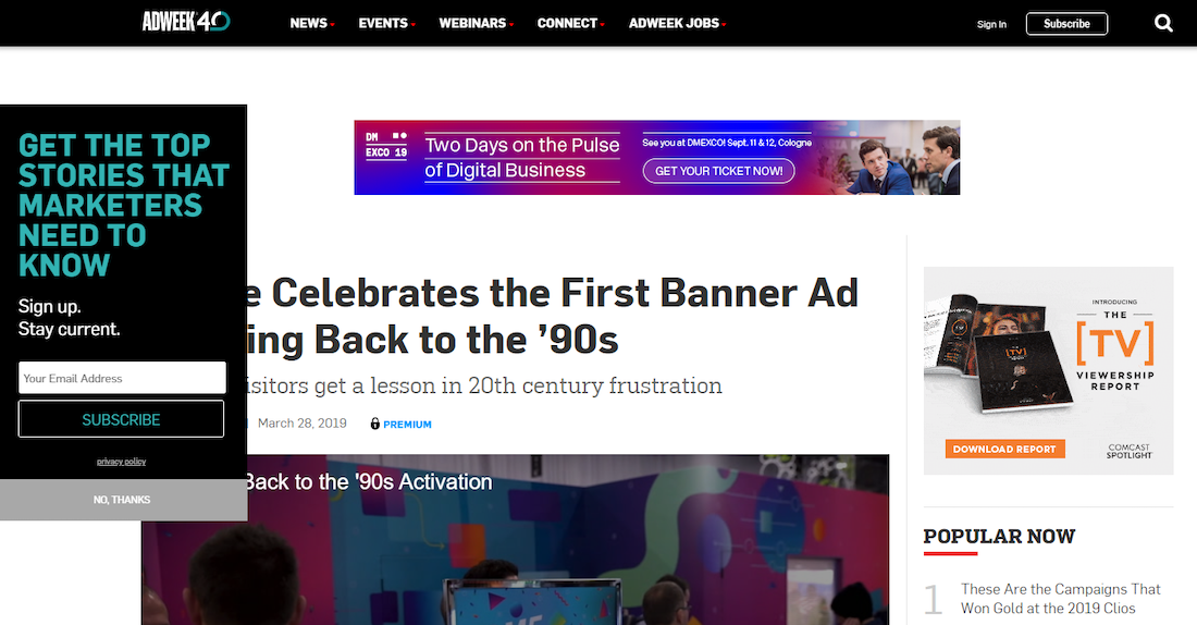
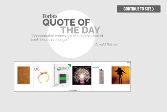
On a welcome page
Welcome page ads are a newer ad format (similar to the pop-up ad) allowing you to simultaneously engage visitors and obtain impressions. Take Forbes for example, who is well-known for their welcome page, consisting of a quote and banner ad before taking visitors to their intended destination:
Sticky ads
Sticky ads are another great way to increase your chances of visibility, clicks, and conversions. However, while making your ads “stick” around with visitors, you must also make sure they’re not interfering with the on-site user experience.
Within your content
Core content areas always get the most engagement and viewability, so native advertising is another great way to avoid ad blindness:
In fact, Infolinks found that “natively integrated ad units were seen 47% percent more quickly than banner ads on the same pages, and that the area on the page containing these units was seen by 451% more people than the banner ad.”
While ad placement can play an important role in engaging website visitors, your ad design matters just as much.
2. Use color to your advantage
Colors can influence people both physically and psychologically, so it’s important to utilize them to your advantage with ad creative. When choosing color combinations, there are three main factors to consider:
- Complementation — how colors interact and complement each other
- Contrast — used to create a sense of division between different elements
- Vibrancy — brightness or darkness used to dictate mood
There are also various color schemes to choose from:
Complementary/Contrasting — Colors opposite each other on the color wheel (e.g., red and green, orange and blue, or yellow and purple) to create contrast and make certain elements draw more attention like this CTA button:

(Note: This color scheme is ideal for quickly catching viewers’ attention and avoiding banner blindness by not only contrasting colors within the ad, but also contrasting your ad colors with the website’s color scheme.)
Monochromatic — Different tints, shades, and tones, of one particular hue (sometimes combined with black and white to break the monotony) used to create a clean and elegant look, but not nearly as attention-grabbing as a contrasting color scheme:

Analogous — Colors right next to each other on the color wheel (e.g., red, red-purple, and purple), with one color typically acting as the dominant color, the second color supporting the dominant color, and the third color acting as an accent. Again, not quite as effective as using contrasting colors:

Once you’ve successfully captured an audience’s attention with a distinct color scheme, you must then keep it by ensuring your ad content is just as alluring as the colors you used.
3. Promote relevant content
It’s your job as a digital advertiser to understand your audience’s pain points and offer only relevant solutions.
Start by selecting the right ad network to link your audience to relevant publishers to create real-time relevance. The Infolinks study mentioned above discovered that ads contextually targeted to the page content increased brand recall by 82%.
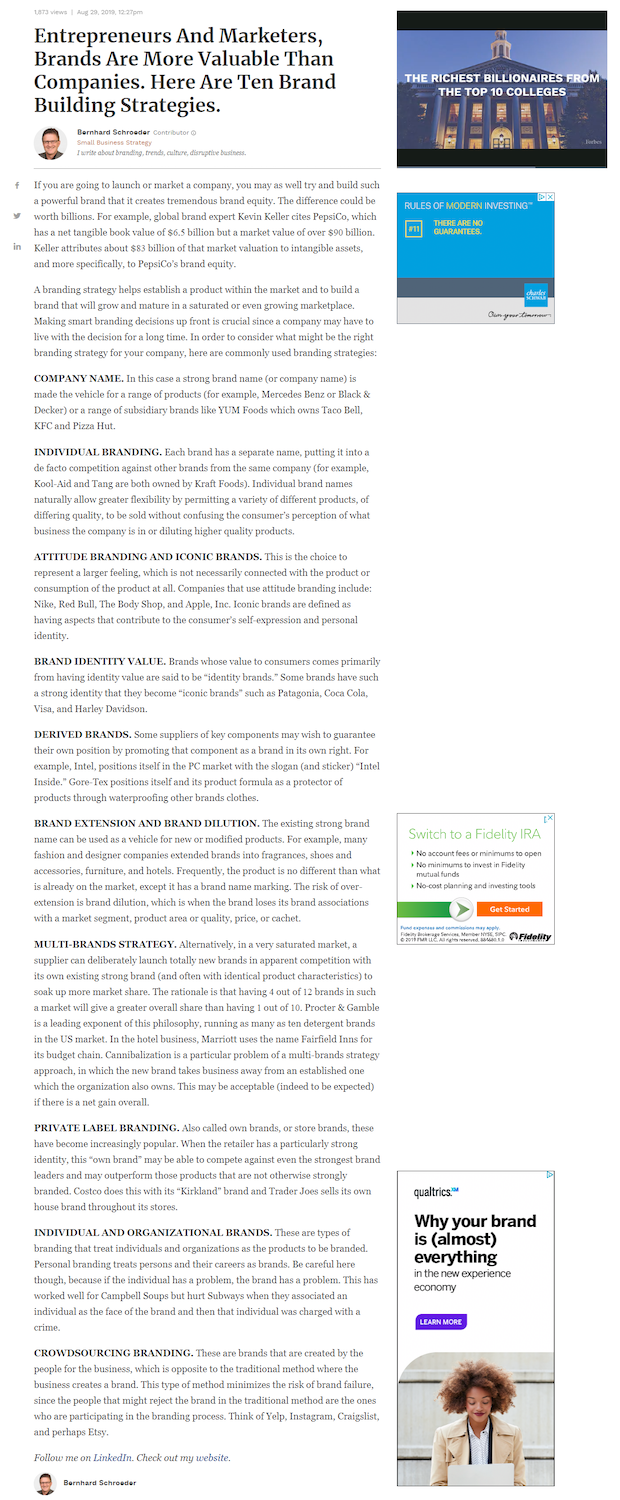
For example, someone reading this article on brand building would likely be most interested in the last ad because it’s also about brand building:
You can also display relevant content based on the keywords that reflect your target audience’s interests, or of course, retarget prospects who previously showed interest in your brand or product.
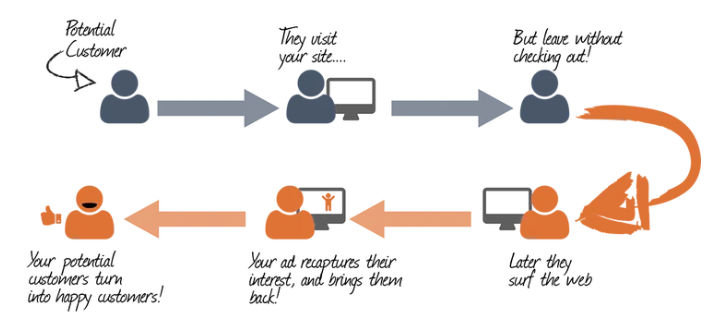
4. Don’t underestimate the power of retargeting
Imagine these different situations:
- A visitor was browsing your page for a specific product but couldn’t decide on the exact one they wanted and left the page.
- Or maybe they ended up finding the product they liked, added it to their cart, but then chose to save the cart for later.
- Maybe then they came back to the cart, started filling out their payment information, but received a phone call, and the payment page expired.
- Perhaps they finally do make the purchase and could now also benefit from other products (upselling).
All of these scenarios are ideal for retargeting banner ads. You can follow these users around the Internet and since they’ve already interacted with your brand, they’re more likely to be interested in your offer and less likely to ignore your ad. The process looks similar to this:
Consider these retargeting statistics:
- The average click-through rate for retargeting display ads is 0.7%, while the average CTR for typical display ads is only 0.5%.
- Web users who are retargeted with display ads are 70% more likely to convert on average.
- Retargeting strategies have proven up to 147% increase in conversion rates.
Knowing these, it’s no wonder retargeting acts as a surefire method to combatting banner blindness.
5. Experiment with ad scheduling and automation
Unless you’re targeting an audience of several million people, advertising platforms like Facebook will start showing your ads to your audience over and over again. Naturally, this leads to ad fatigue — when users have seen your ads so many times, they’ve grown annoyed by them — which is another huge component of banner blindness.
AdEspresso ran an analysis of how ad frequency affects click-through rate and cost per click of Facebook ad campaigns:
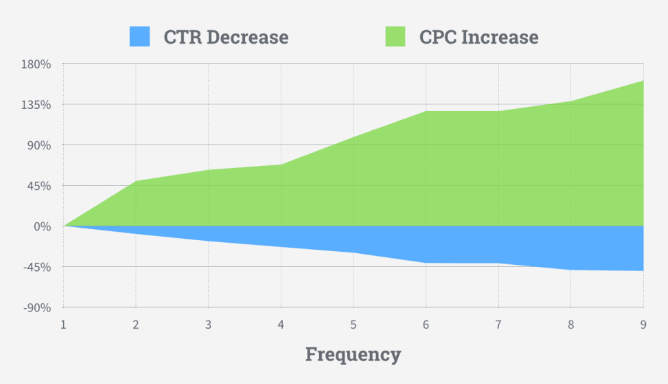
As the graph indicates, they found that as ad frequency increased, the click-through rate decreased, but cost per click increased. So clearly, it’s essential to keep ad frequency low — under 4.
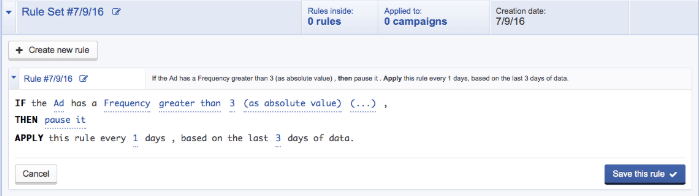
One way to do this is to keep your eye on the metrics in Facebook Ads Manager, and manually pause and change the ads when they get close to 3. Another option is to use a social media automation tool to optimize your campaigns without daily input.
Automation tools can pause ads for you once they reach a frequency higher than 3:
You can also create many various ads and rotate them in to reduce the frequency of each ad.
Ad scheduling is another great option for lowering frequency, as it enables you to only show your ads on certain days of the week and times of the day:
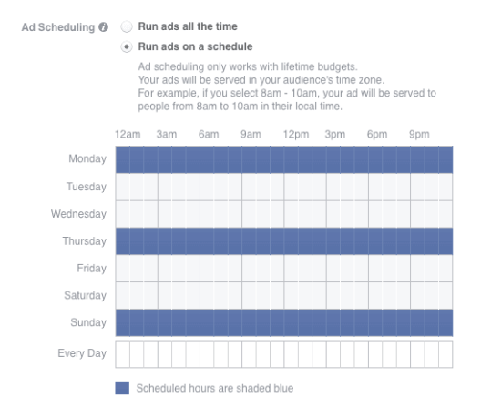
This way, you can deliver a different ad to your audience each weekday, and people won’t suffer from ad fatigue.
(Note: Facebook ad scheduling is done at the ad group level, so be sure to place different ad visuals into separate ad groups.)
Minimize banner blindness but not conversions
Banner blindness is a serious issue for advertisers because no one wants to shell out advertising dollars on ads that get ignored. By providing value, serving relevant ads, and following each strategy mentioned above, you can overcome ad blindness.
Avoiding ad fatigue and blindness is only one piece of the puzzle, though. Once you get people to notice and click-through your ad, you must provide them with what the ad promised and convert them quickly before they bounce. The only way to do this is with a dedicated post-click landing page for each offer.
See how to create unique experiences personalized for every audience with an Instpage Personalization demo here.

See the Instapage Enterprise Plan in Action.
Demo includes AdMap™, Personalization, AMP,
Global Blocks, heatmaps & more.
