Surviving every stage of the web since the beginning, the banner ads are still the pillar of big businesses’ display ad strategy. But as the web gets more cluttered, it gets harder to grab prospect attention. Display banner ads are getting more creative, and the ones that aren’t are getting left behind.
Before we dive into some examples of what to do and what to avoid, let’s run through what exactly the banner ads are, and what makes a good one.
What are banner ads?
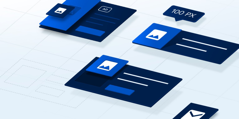
A banner ad is a rectangular internet display advertising format which drives visitors to a post-click landing page when clicked. Common web banners and sizes are:
- Full banner: 468×60
- Half banner: 234×60
- Vertical banner: 120×240
- Leaderboard: 728×90
Like a good skyscraper ad (and generally any good ad), a good banner ad must is optimized for the four C’s:
- Catchiness: Does it catch the eye?
- Clarity: Is the value proposition clear?
- Creativity: Does it stand out from all the boring ads on the internet?
- Clickability: Does it compel the viewer to click?
As one of the most popular ad formats on the web, there are lots of banners to choose from. Let’s see how these 30 examples stack up.
30 Banner ad examples with critiques

First off, this ad for Alliant International University is targeted. At one point I was looking for graduate degrees in psychology and this one is trying to get me to Alliant. Personalization is a key factor in click-through rate. It’s also informative, displaying the types of degrees available, and where they’re available (San Diego and online). However, the design overall looks a little outdated, a little “web 2.0.” And the button stands out, but it doesn’t really look like a button, does it? Additionally, it’s in an awkward place in the middle of the ad.
This ad for Amazon gift cards is attention-grabbing and pleasing to the eye, but it doesn’t really communicate the value of celebrating with an Amazon gift card, which is: Amazon has something for everyone. Also, the button is probably the least eye-catching part of the ad.
What is the square aligned left on this Audible ad? Is it a particular audiobook album? The design is really too small to be clear, making you wonder if it’s really helping the click-through rate of the ad. The text “an Amazon company” adds credibility to the Audible brand. It would be better, though, if it were big enough to read. This button is shaped like a button and it’s colored to stand out from the ad. However, is it clear that it’s clickable? The text on it says “2 FREE AUDIOBOOKS,” but it’s not action-oriented — it doesn’t emphasize that the viewer has to click to get them. You could argue that most internet users understand that you click an ad to claim its offer. We’d counter-argue with: Then why add any button at all?

This CallRail ad has a few things going for it: The button is clearly a button, offering a free 14-day trial. We know what the software does, because of the text above the button. But, why should we use it? There’s no unique selling proposition here at all.
Ads for diamonds are a little different than ones for services like CallRail. Emphasizing the benefit of claiming the offer is a hero shot on the left: A smiling woman who has clearly just received a diamond from her partner. This is much more subtle than when diamond advertisements directly implied that the bigger the diamond, the stronger the relationship. Today that tactic wouldn’t work on people. So, you get this approach, along with two grainy photos of a diamond ring. They don’t really showcase the product that well, do they? The De Beers tagline is also so small that it’s unreadable. What’s the point?
Here’s an ad for GoToMeeting that really doesn’t say much of anything. In GoToMeeting’s defense, this may have been an animated ad, which conveyed the value proposition before landing on this final static image and text. However, you can’t assume that the visitor will see your animation. If you’re going to use an animated ad, make sure the USP is conveyed when the animation stops.

If you’re not sure what Ezoic does, you’re not the only one. There’s an outer-space background here, an astronaut-ish character holding a helmet (?), and text that could not be any more vague: “Balance visitor experiences & revenue.” As far as what it’s offering, your guess is as good as ours, which is to say, not good at all.
Here’s a clear ad from Falcon Digital Marketing. The CTA is bright, and it emphasizes an enticing offer: a free audit. The service is clear: PPC management. However, does it make a good case for the service? “Grow Your Business With Online Marketing” is a little vague. Surely there are some stats from customers that could prove the agency’s efficiency. Why choose Falcon Digital Marketing and not another PPC agency?
This ad from Gobble uses curiosity to get us clicking. Would you click? The food looks tasty, and the offer of $50 off is enticing, but what exactly is the service? The USP isn’t totally clear here. Is it a faster way to cook? Is it more nutritious food? What is Gobble other than new, and why should the modern family use it?

This ad for Hitachi is…futuristic-looking. We’re charging into a white light through a digital tunnel over mountains and wind turbines. It’s eye-catching, as is its call-to-action. However, it’s not clear what we’re going to get by clicking the ad. “New efficiencies”? This is vague corporate jargon that doesn’t compel us to click through.
This ad shows off a pretty innovative-looking laptop bending in the opposite direction. The CTA stands out, and it’s clearly a button. The text “the No. 1 commercial PC brand” adds some credibility to the ad, but it’s not clear who rated Lenovo number 1. Also, the representation of two brands in the ad may be confusing to people. Lenovo and Windows? Whose website is this ad taking us to? Somewhere we can buy Windows software or somewhere we can buy Lenovo devices with Windows software?
Here’s a clear, straightforward, eye-catching ad. The CTA button is bright; it’s clickable. The value proposition is clear here too: Learn the 4 keys to generating seven-figure sales on Woocommerce. Way to go, Liquid Web.

This Microsoft doesn’t look like an ad, but instead, a wireframe of an ad. A skeleton of one. What happened here? It won’t stand out against most website backgrounds. The CTA is noticeable and clear, but there’s not much chance people click it. Remember, every ad has to answer the question “What’s in it for me?” This one doesn’t at all.
This Bing ad is straightforward and the value proposition is clear: be found, expand your business. However, it could be much more compelling. A quick look at the Bing website reveals that by only advertising on Google, you’re missing out on 68 million searchers. Sounds like something worth putting in an ad, doesn’t it?
This ad for Mucinex looks good at a glance. It stands out, the design is professional, the CTA is bright and clickable. But all credibility is ruined by the grammatical mistake in the headline: “Nothing last longer”? This will drive a prospect away, even if they’re suffering from cold and flu.

This ad for New England Institute of Technology has a big logo that identifies the school. The bright CTA captures attention, and the 50 degree programs are great to give people the option of choosing from. But overall the ad looks like it was designed in 2008. Also, in a time when college is more expensive than ever, it would probably make more sense to strike “Turn your passion into a great career” from the ad, and substitute it for something about job placement. Will a degree for this school pay for itself?
New Jupiter Media starts off well with this ad, using red text to grab attention and a red CTA button to do the same. The Google and Bing partner logos add credibility to the business. However, the headline ruins it for us. The leading digital marketing agency? Says who? This is calling yourself the best. If you wouldn’t believe it from your local coffee or taco shop, why would you believe it here?
This ad is straightforward, attention-grabbing, and its value proposition is clear. Save money when you shop at Office Depot/OfficeMax. However, like several of these other ads, it looks like it’s been running for about a decade.

Unfortunately, there’s not much to say about this Palms on University ad. College just got better? How? Is there a CTA here? The white background is likely to blend this ad into the website it’s on. All-around, nothing redeeming for the Palms here.
The one thing this ad has going for it is a recognizable brand: S&P Global. Other than that, it’s not eye-catching, it’s not clear what the USP is, and it’s not creative at all. This is one of those cases where the offer isn’t explained simply enough. What is this ad for?
Questions are great to use in advertising because they engage the reader. Need money for college? If you’re preparing for college, chances are the answer is “yes.” SallieMae is a recognizable brand, and the ad is designed professionally. The “Get started” CTA button is noticeable and clear (with an arrow visual cue), though the rest of it’s not all that eye-catching. Plus, there’s no great USP here. Why is SallieMae better than other student lenders? Low interest rates? Why should we click?

This ad from Southwest is mildly eye-catching with bright colors, as is the CTA button (which is clearly a clickable button). It’s also relevant since we’re located in California. But as far as a USP goes, is it nonstop flights that will get you to click through? The subheadline “Book a low fare today” is closer. Those 250 nonstop flights could all be places nobody wants to go…
Make it today? It’s unclear what the images in this ad are. It’s not all that creative or eye-catching with dull and dark colors. There’s also no value proposition here. This isn’t much of an ad from Squarespace.
Here’s an ad from Syneos Health. We wish we knew what it was advertising. It’s certainly eye-catching, but it’s not clear or all that creative. The CTA button is clearly a button, and it’s noticeable too. But outside of that, there’s not much going for this ad. “Shortening the distance from lab to life”? If we’re going to click more, we want to know what we’re going to learn more about.

TD Ameritrade is a well-known brand, and its banner ad here is eye-catching. The value proposition is also clear: It’s easy to open an IRA. The secondary value here is: You could also get up to $600 when you do it. This ghost button is clearly a CTA, marked by the little arrow icon next to “Open.” It’s not the most creative ad, but it gets eyes and it gets the point across.
This Walden University ad is mildly attention-grabbing, and the CTA is clickable. However, the chances that a visitor clicks are slim. This USP is too vague. “Success happens here”? We don’t even know where the school is. Online? How about degree options? There’s nothing here that differentiates Walden from any other university.
This ad from Fiji Airways takes advantage of an eye-catching photo of a tropical beach. It also highlights affordable round-trip tickets, and the CTA is clear. However, the headline “Complete your purchase” is confusing and a little worrisome, considering I’ve never been to Fiji Air’s website. Did someone try to book a flight with my info?

This WPEngine ad uses a powerful statistic: 30% of sites on the internet are WordPress. When something is popular, we tend to believe it’s valuable. People must be using it for a reason. What reasons are those? The company will show you. The orange highlight grabs attention on an otherwise bland ad. If you’re thinking about building a website, there’s a decent chance you’ll click through to learn what WordPress has to offer.
This ad from GoToWebinar may pop on a white background, but the blue button doesn’t pop on a blue background. Outside of that, “Free” in the CTA adds to clickability, but this ad isn’t very clear or creative. What makes GoToWebinar’s reports better than others? Why do they lead to qualified customers? Surely there’s a more descriptive headline than this one.
This Marriott ad would be helpful if I had viewed hotels in Houston Texas, or was thinking of traveling to Texas any time in the future. However, I have no plans to do so. The ad does a good job of highlighting low rates, and the CTA is attention-grabbing. But, it’s just not relevant enough to get me clicking through.
Combine banner ads and post-click landing pages
The clearest and most eye-catching, creative, clickable ad is still nothing without a message-matched post-click landing page to close the deal. Banner ads, remember, are only the first half of the campaign (aka the pre-click experience). The post-click landing page — what happens once a visitor clicks through — must be optimized for conversion. With today’s takeaways, start creating compelling banner ads and post-click landing pages with the industry’s most robust post-click optimization platform.

