Every second you’re awake, your brain produces enough electricity to power a light bulb.
The generators responsible are 100 billion microscopic cells called “neurons.” They power your body by sending electrical signals from your brain that direct your heart to pump, your lungs to expand, and everything else to perform functions necessary for life.
Each move you make takes the coordination of countless cells, organs, muscles, tissues, and tendons. Yet, taking a single step forward seems more like second nature than a physiological miracle. After all, you’re just putting one foot in front of the other. How complicated could it be?
As it turns out, more than you’d think.
That simple movement takes the cooperation of approximately 200 muscles to complete. Not to mention the visual cues that your brain has to process to decide where to step, what to avoid, how fast to move, etc.
On your post-click landing page, those muscles, organs, and electrical signals are replaced by buttons, visuals, copy, and code. They work together to perform one incredibly difficult function: convince the most powerful supercomputer known to man, a.k.a. the human brain, to take action.
Whether it’s to buy, subscribe, or download, when a post-click landing page is “anatomically correct,” it can move its visitors to click a CTA button. Different shapes and colors scream “look here” and “press me,” while headlines capture attention and testimonials build trust.
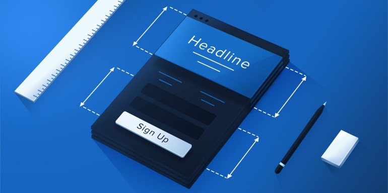
The anatomy of a post-click landing page isn’t as complex as our own, but to the untrained eye, it’s still difficult to understand. Today we’re going to break it down to help you piece together the puzzle that is a persuasive post-click landing page.
What is a post-click landing page?
A post-click landing page is a standalone web page that people reach after clicking a promotional link in an ad, a social media post, a search result, etc. It’s designed with one purpose in mind: to get its visitors to convert.
That conversion goal can be anything from starting a free trial of your software to simply subscribing to an email newsletter. To achieve that goal, your post-click landing page should leverage psychological principles, color theory, UX best practices and much more…
The anatomy of a perfect post-click landing page
1. No navigation
When you created your website, you wanted to make it easy for your visitors to navigate — and rightfully so. The easier they can find their way around, the faster they’ll be able to get what they want, and the better experience they’ll have on your website.
With that in mind, you connected all your pages to each other via the main navigation bar on the top of your site — the homepage, your blog, checkout — they’re all separated by just one click. Design-wise, you’ve done well, but creating a post-click landing page is different.
In the relationship between your website and your potential customer, the post-click landing page is your ultimatum. It says “Make a decision: convert, or get out.”
It doesn’t need to link to any other page on your site because it’s like all of them crammed into one — it’s a short, virtual elevator pitch. It lists everything your prospects need to know about your offer and leaves the decision to convert up to them.
If by the time they get through it, they’re still not convinced, make them hit the red “X” in the corner of their screens to exit their browser window, the way this post-click landing page from DataWeld does:

2. Headline/Sub-headline
Next to your call-to-action, your headline is the most important part of your page. Without a compelling one, most people won’t even bother to read the rest of your post-click landing page.
The secret to writing a good headline is to make sure it conveys your unique selling proposition (USP) — the thing that sets your product or service apart from the others in your industry.
Will you help your customers generate leads faster than their current agency? Will you help them generate higher quality leads? Is your product more affordable than what’s currently on the market? Communicate that in your headline or sub-headline.
Legendary copywriter John Caples identified four main types of attention-grabbing headlines that’ll help you get started pulling prospects in.
1. News: These headlines introduce a new solution, like “Finally, an easier way to do your taxes.”
2. Self-interest: These headlines appeal to prospects’ inherent self-interest, like “The guaranteed way to get a fuller head of hair.”
3. Quick & easy: These appeal to our desire for quick fixes, like “Drop weight fast with this miracle pill!”
4. Curiosity: These headlines pique readers’ curiosity, making them want to read more. For example “I couldn’t believe how much money I made just a week after starting this work-from-home program.” Or, the headline that made Caples famous: “They Laughed When I Sat Down At The Piano, But When I Started To Play…”
You can start with just one, or combine them for an even more powerful result. The most captivating headlines come from a blend of two or more of the types listed above, and when written well, they do one more critical thing:
They boost a visitor’s trust in your brand by matching the message of the ad or post that they came from. Aptly, this is known as “message match.”
For example, if you’re running an ad for lead generation software, make sure “lead generation” is mentioned somewhere in the headline of your post-click landing page. Otherwise, you risk leaving your visitor confused, wondering how they ended up on a page that has nothing to do with the ad they clicked.
Here’s how to create a great benefit-oriented headline that matches well with its corresponding social media post, courtesy of Hired:


For more ideas on how to craft powerful headlines, check out this blog post or watch this video.
3. Engaging Media
As creatures capable of processing visuals up to 60,000 times faster than text, your visitors would much rather you show them how your product works than telling them in writing.
Instead of using irrelevant stock photos as worthless placeholders, employ the use of a “hero shot” to give them a glimpse of how your product or service would change their lives for the better.
Or, just as useful, create a short video explaining how your product works, with a focus on how it will benefit your prospects — like this one from point of sale software TouchBistro.
If you can, try to include real, satisfied customers in your video or photo. That way, along with explaining your product or service, it’ll double as social proof.
4. Concise, benefit-centered copy
On your post-click landing page you’ll be tempted to tell your prospects about the high-powered, new and improved thingamajig that makes your product so great. Or how your services are “cutting-edge,” “innovative,” and “industry leading.”
Do them a favor and don’t.
Buzzwords like “cutting-edge” are totally subjective and don’t explain the quality of your offer. The same goes for the description of your product’s features. Who cares if they’re new and improved? What does that mean for the visitor?
Will a “cutting-edge” service help them create websites in minutes? Does your “new and improved” feature mean they’ll be able to chop vegetables faster than ever before? Make sure that when you’re making the case for why your prospects should convert, you do so by conveying benefits over features. And make it snappy.
Our attention spans have shrunk to less than 8 seconds, so when we read online, we skim. Employ the use of numbered lists and bullet points to separate your copy into easily digestible chunks. Don’t make your prospect read more than two to three consecutive sentences of block text.
Here’s a great example from Zaius on how to communicate benefits quickly:

Of course, there are exceptions. If your product is particularly pricey or complicated, it may require a lengthier explanation. But for the most part, it’s best to get the message across in bite-sized chunks.
5. No links
Get yourself a funnel, drill a bunch of holes in it, then use it to pour water into a cup. Not working all that well, is it?
That funnel is your post-click landing page, and each link is a hole. The more you include, the more likely it is that your prospect escapes your page before they convert.
“But, wait,” you argue. “All the links on my post-click landing page open in new tabs. That way my post-click landing page will still be open in the background.”
Yeah? You want to take the chance that people who can’t focus on one task for eight seconds are going visit all those other pages, then come back to click your CTA button?
You want to take the chance that, in a time when people are busier than ever before, something won’t come up in the time between they’ve clicked those links and made their way back to your post-click landing page?
Good luck. We wouldn’t take those odds.
We recommend you don’t link to any other pages on your post-click landing page (with the exception of your privacy policy or terms of service if absolutely necessary).
6. Social proof
If you’re like most people, before you purchase a new product or subscribe to a service, you’ll ask around your social circle for recommendations from people you trust.
This holds true even online.
Research has shown that 92% of people value recommendations from a peer, and 70% will trust a recommendation from someone they don’t even know.
So what’s that mean for your post-click landing page?
It means you should leverage one of the most powerful ways to boost the odds that people click your CTA button: adding social proof.
Authority badges like awards from other websites, logos of well-known companies you’ve worked with say to visitors “We’re good enough for them, so we’re likely good enough for you, too.”
Here’s a great example from Jenny Craig of how to use authority badges to your advantage:


If you’re on social media and have a huge following, adding some “like,” and “follow” buttons can serve as social proof as well. They communicate to your prospects: “Look at how many other people find our content valuable. We’re authorities in the space.”
Here’s an example from senior care site, LivingSenior:
![]()
They’re especially great because unlike most social buttons; they won’t drive prospects off the page. If someone clicks “like” on the Facebook button above, they’ll instantly subscribe to LivingSenior’s updates on the social network.
Lastly, and possibly the most powerful of all social proof, is the testimonial. When used right, there’s nothing more powerful than a recommendation from a satisfied customer.
Get quotes from them — and don’t settle for something generic like “They boosted our ROI.” Get specific.
Get numbers. Get names, titles, and photos of the people who are speaking on behalf of your business. The more you can display about them, the more real they become to your visitors.
For example, what’s more convincing to you — this testimonial:

Or this one?

7. A strong call-to-action
This is the moment you’ve been waiting for. The searching for powerful synonyms to create compelling copy, all the headline testing and customer interviews have been done for one reason: to get your visitors to click that call-to-action button.
This is the one element that jumps out at your visitors. When they reach your post-click landing page, they should notice your CTA button immediately.
That doesn’t mean you should use red or orange or bright yellow because those are the colors you think are attention-grabbing. It means you should use color theory to find a hue, tone, tint, or shade that stands out from the rest of your page.
As far as copy goes, don’t settle for something boring and overused. Use your USP to help you come up with something more compelling.
For example, if your email newsletter promises to make its subscribers better writers, then don’t just use “Subscribe” or “Sign up” as your button copy. Use something like “Show me step by step,” or “Teach me the secrets to better writing.”
Here’s a call-to-action from LeadGenius that plays off its post-click landing page headline well:

Lastly — make sure your button looks like a button. Your prospects can’t convert if they don’t know what they need to click to do it.
Sure, this should go without saying, but in the past we’ve seen examples like the one below, which prove maybe it’s not common knowledge like we thought:

8. Minimalist footer
If your post-click landing page has a footer, it shouldn’t be like the one on the rest of your website. It shouldn’t have a sitemap, related blog posts, or any links to your social media accounts.
Why?
Because with each link you add, you drill another hole in your post-click landing page.
If you do choose to have a footer, use it to display nothing more than up-to-date copyright information, terms of service, and your privacy policy — like our post-click landing page for 35 Techniques To Triple Your post-click landing page Conversions does:

9. Contact information
Sometimes, especially if your offer is pricey or complicated, your post-click landing page visitors are going to want to talk to a representative from your company.
Give them more than just a contact form to fill out. Add a phone number to your page where they can reach you if they have any questions — and make it click-to-call.
The majority of web users browse via mobile now, so clicking a linked phone number is easier for them than memorizing 10+ digits. Follow Red Books’ example on this one:

Your turn
Remember: this is just the basic anatomy of a high-converting post-click landing page. Different combinations of the elements above will produce different results for individual businesses. You’ll need to continually A/B test to perfect yours.
Sign up for an Instapage Enterprise demo today.

See the Instapage Enterprise Plan in Action.
Demo includes AdMap™, Personalization, AMP,
Global Blocks, heatmaps & more.
