In your everyday life, saying two simple words has the power to make you and the people around you happier, more self-confident, and physically healthier. What are they?
“Thank you.”
This seemingly magic phrase is just as important in marketing.
When a prospect gives you their email address in exchange for a white paper, or their hard-earned money for a subscription to your service, it’s key to remind them that you’re thankful for them. After all, without customers, you wouldn’t be in business.
So what’s the best way to say “thank you”? Let’s dig in.
“Thank you” doesn’t mean “Goodbye”
Most of the time we use the words “thank you” at the end of an interaction. We say “thanks for the coffee,” then turn away from the counter. We say “thank you for holding the door,” and continue to our destination.
But if you’re a savvy marketer, “thank you” is just the beginning.
At least one study has shown that 50% of leads are qualified, but they’re not yet ready to buy. And even when they are, additional research has shown that customers are worth up to 10x their original transaction. So what does this mean for you?
It means that you need to continue the conversation — to get your leads and customers to come back for more. One of the best ways to do that is with optimized “thank you” pages.
The difference between an optimized and unoptimized thank you page
We can all tell the difference between a careless “thank you” and a sincere one. A quick “thanks” as you stare down at your cell phone doesn’t carry much weight.
When you’re truly thankful for someone, you stop what you’re doing, look them in the eye, and say “thank you.”
In marketing, a good “thank you” says “We really appreciate you. Let’s continue this relationship,” the way this one from Impact Branding & Design does:

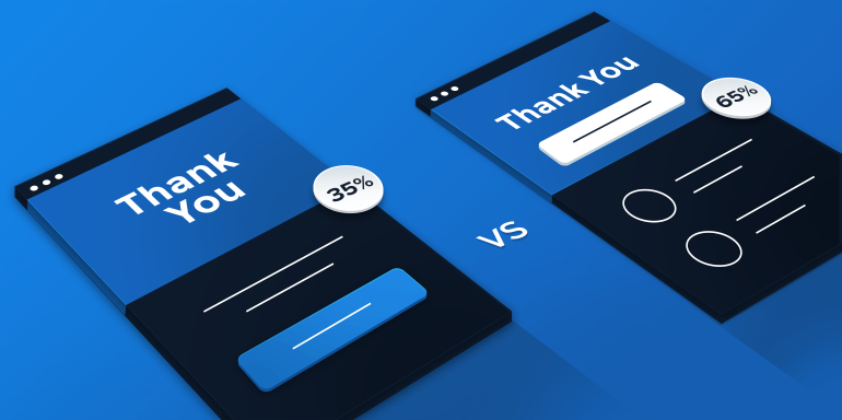
To say “thank you” the right way, you’ll need to make sure your page is optimized — that it contains all the elements necessary to show gratitude, and continue the conversation. One of the simplest and most effective ways to do that is by A/B testing its elements. Here’s what you should be testing on yours:
What to A/B test on your thank you page:
1. Headline/Subheadline
A headline that reads “Thanks for downloading” falls short in so many ways. This is your chance to look your visitors in the eye and say “We truly appreciate you.” Tell them the way Impact did above, and then let them know in your subheadline what’s about to happen next.
Are you sending them their report? Should they click below to download? Test multiple variations of your headline to find out which your visitors react to best.
2. Copy
You already know that it’s important to show gratitude on your thank you page, and explain to your prospects where they can find their content — but just as important is how you do that.
Are you being true to your brand identity? Does the language on the page sound like it’s coming from you?
How about your word choice? Are you using industry mumbo-jumbo, or are you writing in a basic way that your prospects can understand?
Replacing just one word could mean the difference between convincing your prospect to move further down your funnel, or driving them from your website — so choose yours carefully.
Test different tones, words, and phrases to see which speaks to your audience the best.
3. Survey
The best content is personalized content. To make yours even more personal, ask your fans more about them.
What are their biggest challenges? What are their goals? What kind of feedback can they offer you?
Test different questions to see which your prospects are most likely to answer, and use their submissions to give them an even more personalized experience. Here’s an example of how to do it from Single Grain:

4. Related content
One of the most effective ways to get more out of your thank you page is by using it to push prospects further down your marketing funnel. Do that by offering them content related to the offer they just claimed.
“But how do I know which content to direct them to?” you ask.
Well, you could pick any old blog post or white paper having to do with the subject of the offer they just converted on. Or, you could be smarter than that, and use content mapping.
Content mapping involves personalizing content offers based on three things:
- Your buyer personas: Who are your ideal customers?
- What stage of the buyer’s journey they’re in: Are they in the awareness, consideration, or purchasing stage?
- The content you’ve created: What have you already crafted? Blog posts? Ebooks? White papers?
Without knowing who your audience is, what they want, and what you have, you can’t create a compelling next step.
Your buyer personas and the content you currently have are unique to your business. What’s more broadly applicable are the stages of awareness, and the best content to offer at each one.
There are three stages of the buyer’s journey: awareness, consideration, and purchase:

David Skok describes the differences between each stage using a great analogy:
“Imagine that you wandered into a clothing store while walking around the neighborhood. You didn’t have a particular idea of anything you want to buy. You are approached by a hungry salesperson who is convinced they can get you to buy something. You are annoyed by too much attention, and feel that they are ruining the peaceful browsing experience that you hoped to have.”
In this scenario, the you’re in the “awareness” stage. You don’t know what you’re looking for; you’re simply browsing.
If, say, you walked into the store with the intention of finding a black sweater, you would be in the “consideration” stage. You know what you want, but you’re not sure that this store has the kind of black sweater you’re looking for.
If it does, then you move on to the “purchase” stage. You’ve evaluated the product and found that it meets your needs, so you buy it.
Which stage your buyer is in affects the content you push them toward next on your thank you page. According to a survey from Regalix, which surveyed 285 B2B marketing executives, the best content to offer at each stage is as follows:
- Awareness
- Social media: 83%
- Blog posts: 81%
- Infographics: 81%
- Consideration
- White papers: 78%
- Websites: 75%
- Web-based events: 72%
- Purchase
- Website: 56%
- Case studies: 47%
- Research Reports: 39%
- Videos: 39%
HubSpot also offers some valuable advice when it comes to guiding prospects toward related content:

Consider where your prospects have come from, and try to determine what the next logical step is for them. If they’ve downloaded some light, top-of-funnel content like a tip sheet on how to boost conversion rates, then guide them toward a consideration piece like a case study on how a business used your service to boost conversion rates. After that, try to get them to sign up for a free trial, a demo, or a consultation.
5. Social share options
Thank you pages are perhaps the best place to put social share buttons. That’s because unlike on your post-click landing page, your prospects have the opportunity to share after they consume your content. They’re inherently more likely to share with their social circles because they’ve already evaluated your ebook, or tip sheet, or white paper.
Before, they don’t know whether what you’re offering is valuable, or if it’s just another piece of hyped-up, recycled, cookie-cutter content.
If you’ve done your job and created something original and highly useful, they’re more likely to share it.
Test different button locations and designs. Try giving them a pre-written tweet (like we do in this article) to make sharing even easier, and see if it has an impact on conversions.
6. Secondary CTAs
Now that you’ve mapped where they’re headed next, it’s important to use a powerful call-to-action to get them there. Fortunately, your thank you page already has a powerful, persuasive element on its side.
In psychology, the principle of reciprocity states that if you help someone out first, they’re more likely to do something for you in return. Take advantage of this principle by using a CTA to compel your prospects to act on another offer, the way HubSpot does on this thank you page:

Test button colors, shapes, sizes, and copy to see which produce the biggest conversion lift.
If you need help designing a compelling CTA button of your own, check out this article.
7. Testimonials
Yes, your thank you page can feature testimonials, too. They wield just as much power here as on the post-click landing page that came before it.
Test different photos, quotes, and formats. For whatever reason, you may find that your prospects react to one testimonial better than another.
You’ll never know if you use the same ones on every thank you page.
How to create and A/B test your thank you page
With Instapage, A/B testing your thank you page is easy. Here’s how to do it:
Step 1
Login to your Instapage account. If you don’t have one, start your 14-day trial today.
Step 2
Click the blue “Create new page” button in the upper left corner of your dashboard. Then decide whether you want to create a page using one of our 100+ templates, upload an existing page so you can edit, or use a .instapage file you’ve already been working on:

Let’s operate under the assumption you’re like most Instapage customers, and you’ve clicked “Pick a Template.”
Step 3
Sort through templates by clicking the checkbox that reads “thank you page,” then choose the one you want to use:

Step 4
Create your page using the elements we mentioned above by clicking to edit text, uploading and dragging images to position them, and much more. (Learn more about what you can do with Instapage’s fully customizable pages here.)

Step 5
Create a variation of your page to A/B test. Navigate to the upper right corner of the page builder and click “Create A/B test.” Doing this creates a duplicate of your page.
Now, since A/B testing requires testing only one element on a page at a time, we adjusted the headline on our variation to test it against the original.

Keep in mind, you can test all the things we mentioned above and more, like the copy, testimonials, and images.
Step 6
Once you’ve created both a “Variation A” and “Variation B,” get an idea of what your pages will look like when they’re published by clicking the “Preview” button in the upper right of your screen.
Step 7
When you’re ready to publish both variations, click the “Publish” button in the upper right of the builder.
Step 8
Monitor your pages using the most advanced analytics in the industry. From your dashboard, look for the page you’ve just created and click “Analytics,” to see statistics about how your variations are performing against each other:

Step 9
Optimize your page by using the headline that wins. Now repeat this process with other page elements to create a powerfully optimized thank you page.
It’s that easy!
Express your gratitude with an optimized thank you page, and watch your prospects reciprocate by downloading, subscribing, and purchasing. Start creating post-click pages today, sign-up for an Instapage Enterprise demo.

See the Instapage Enterprise Plan in Action.
Demo includes AdMap™, Personalization, AMP,
Global Blocks, heatmaps & more.
